Saturday, 28 April 2012

Crazy For Ikat

Ikat has been on the design scene now for a few years,and I'm pretty confident that it's one to stay.

I remember seeing it for the first time,on an episode of HGTV with Lynda Reeve's,she was introducing the trend and was showing us pillows she had purchased to put in her office. That's when it hit me,I was crazy for this ethnic trend.

Ikat meaning "to tie" or "to bind" is a style of weaving,and it differs in pattern depending on the region it comes from. These patterns are handed down through the generations of family,making it all that much more charming to own a piece.

I see it everywhere from fabric on chairs,pillows,ottomans to carpets,wallpaper,dishes and more recent, tile. Wherever I see it one thing remains,it's always the star in the room,and one I'm sure I will never tire of looking at.

Enjoy the feast for the eyes!


D.


Friday, 27 April 2012

My Main Bathroom

Hi everyone,

My main bathroom has received quite a bit of attention. It has been the subject of a few blogs, as well as being added to almost 6000 idea books on Houzz.com. That's a lot of people in my bathroom! On that note I thought I would talk a bit about this space.

This is not a big bathroom by any means,but it manages to pack everything I wanted to see, in this space. Let's start with the vanity.

I'm a big fan of focal points in every room, and I challenge you to think about this the next time your building or renovating. The door to the bathroom almost always stays open, affording you a view in,so make sure that when it is, you have something beautiful to look at,("anything please but the toilet"!). In mine it's the vanity.
The vanity,and I am proud to say, is from Ikea. The only thing that I have done different is float it off the floor, giving it a more custom look. Next I splurged and I mean splurged on those beautiful handles, but it's truly the jewelry on the classic black dress.

Off to the left of the vanity is a alcove with custom made 3inch thick solid fir shelves. I have always had open storage in my bathrooms,similar to this one, simply because I love to display my things,and I think it makes a bathroom more interesting then your standard tub,toilet and shower.

The last thing I did in this bathroom was to create another interesting focal point,and that is the tile in shower.

Here the tile from the floor runs up the back of the shower wall to give it some interest ,the other 2 walls have your modern take on the classic subway tile.

You have probably noticed that I don't have a glass shower door. Instead I have opted for a shower curtain,(custom made by my mom, I might add.) I am not a fan of the maintenance glass requires,besides with new fabric and a lot of begging and pleading with my mom, I can have a whole new look and feel in the bathroom with just a simple change.

So that's it in a nutshell. If you have any further questions on anything you think I missed, I invite you to contact me, and I would be happy to answer them for you. I look forward to any comments you might have.
Have a great weekend!
D.

I wanted to share some pictures with you of bathrooms that I find inspiring,although the spaces are not huge they pack a lot of style in each.
Enjoy.


this actually makes the toilet cool to look at!


All pictures from http://www.houzz.com/

Monday, 23 April 2012

Kelly Wearstler

Kelly Wearstler, a name synonymous with "style", whether it be in designing jaw dropping interiors or brilliantly composing her new line of clothing found at her flagship boutique in L.A.

Regardless of what Kelly is doing one thing remains,she is a design force,one to be reckoned with,and someone that I admire greatly.

Kelly's use of color and pattern,civilized with objects that always seem larger then life,are nothing short of genius.

I have never been a "color" person,always opting for a more soothing neutral palette ,but Kelly's use of both has me wanting to ditch the whites in favor of a skittles explosion!( This is usually the point where I start to hyper-ventilate )

Having read her last book"Hue",I poured relentlessly over the pages,studying every last detail,constantly asking myself with every turned page "How does she do it!". How can she make so many colors and patterns in one room work? And regardless of how she does it.....in the end it just simply works.

At the vintage furniture store I work for, we often can be heard saying" OMG! that chair is soooo Kelly Wearstler "or "Lets do a Kelly Wearstler styled window display."

I know that most of you on first inspection of her interiors will be compelled to say,"there is no way I can accomplish this",and to a certain extent I will agree.

As a designer I have learned, that there is always something in another designers work that I can take away and use in my own interiors,even if it's a small detail. With Kelly it is her originality.

The next time you are thumbing through the pages of her book or scrolling down her website,I invite you, for a moment, along with myself, to try hard to think outside the box.

I thank you for this Kelly, as always you have, and will continue to inspire me.

Enjoy!
D.
http://www.kellywearstler.com/


Thursday, 19 April 2012

coffee table displays

Hi everyone,
I want to talk today about displaying your coffee table.
 There are so many ways of going about doing this and really there are no hard fast rules as to how to accomplish this. Your coffee table ,should I say is like a blank canvas,and it's up to you to create your master piece. First decide what purpose it serves? Do you have small children? If so then likely you will want to keep sharp and breakable objects off. Do you entertain a lot then you might decide to keep whatever is on top low enough that it doesn't interfere with conversation. This all being said look around your home at the different objects or collections you have that you might want to display.How about books? These are always a must for me, not just for the beauty, but because stacked with objects on top,will lend height and interest to your display. And last but not least flowers or greenery, it will always pull a display together giving it that organic element that's always needed.

This is my coffee table. I enjoy anything and everything organic, the antlers, the coral, the horn on the magnifying glass,even the wood on the number 2, I have a theme and I have carried it through. Then for a pop of contrast and interest I've added the Tom Ford book and lastly the greenery in the vase sitting on top of the books for added height so everything is not all on the same level. The result really tells a lot about me, and the things I like,and so should your coffee table.
Here are some more of my picks for beautiful table top displays.
Enjoy!
D.


This coffee table has one big attention grabber and that is the beautiful shell,not much more is needed then some simple white flowers and a couple of books.
This coffee table doesn't need much, if anything simply because it's the show stopper
I love that they have used the flowers here as there focal point,something that can be changed regularly creating a different feeling each time
Again,like mine the table is covered by interesting things to look at, inviting ones to explore whats on top!
Pieces that tell a similar story.
D.

Tuesday, 17 April 2012

wallpaper.

Hi everyone,
So this past weekend I under took the task of wallpapering a wall in my bedroom. After much debate I just decided to go ahead and bite the bullet and try it myself. The wall I decided to do wasn't huge and I thought it would be a great place for me to try my hand at this. I had watched 2 or 3 You Tube videos and asked lots of questions and managed to con my husband into helping me, he is a magician with a tape measure and a very steady hand at cutting. Anyways after much sweating and swearing and a near divorce (" somewhere along the line he thought he could just take over and tell me what to do") I finished, and the end result is......... I love it and YES! I would do it again. You know what they say practice makes perfect!
So here is the before picture........
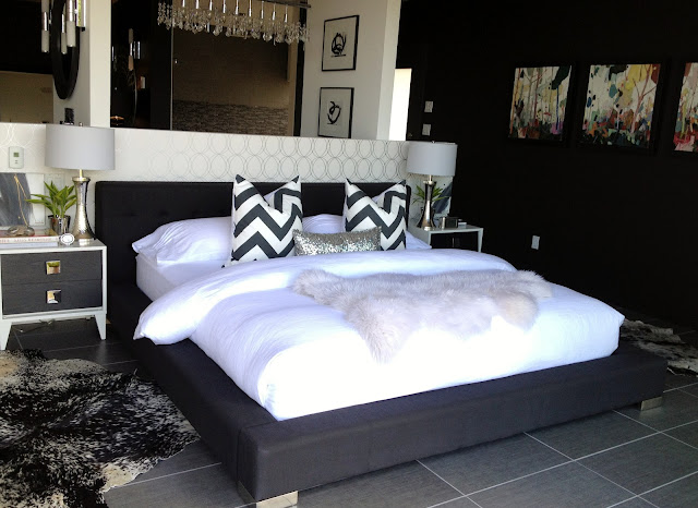
I always felt this place lacked something. This is quite a large space and very open, much like a loft,the bathroom which sits behind that wall takes up most of the space,so my actual bedroom is not very large and other then the wall that the bed backs on to there really is no definition.
So I started by painting the outside walls black, Benjamin Moore's Onyx , to create a bit of intimacy and to make those outer walls recede and disappear. My next task was to make the wall that the bed is against more of a focal point,I didn't want to paint this black as well I felt it would be to much and the over all effect would be lost.That's where the wallpaper came in.
Drum roll please........... Oh ya and by the way this is Graham and Brown's "Darcy" in pearl and silver.


And yes that is white bedding,despite the fact that I am married to a builder and I have a black dog I have decided to have white bedding ! I get a tremendous amount of sun in my bedroom and I have thrown away bedding even in the winter because of what the sun has done to it,so this year I have chosen white linen. Why? I feel it is more forgiving then soft egyptian cotton and I love the lived in look it's going to get over time. I got mine from a site on Etsy called Lovely Home Idea and I felt that the prices as well as the quality were fantastic.  Also I would like to mention that my large 24x24 pillows also came from a etsy shop called Artistic cotton check them out.And besides as you can see in the next picture I'm not going to treat it to precious,besides look at how well she goes with everything.

Lola!


Here are some pictures of other bedrooms with wallpaper that I find inspiring!


Enjoy! D.